What MAPA Feria de Arte Taught Me About Texture in Branding & Packaging
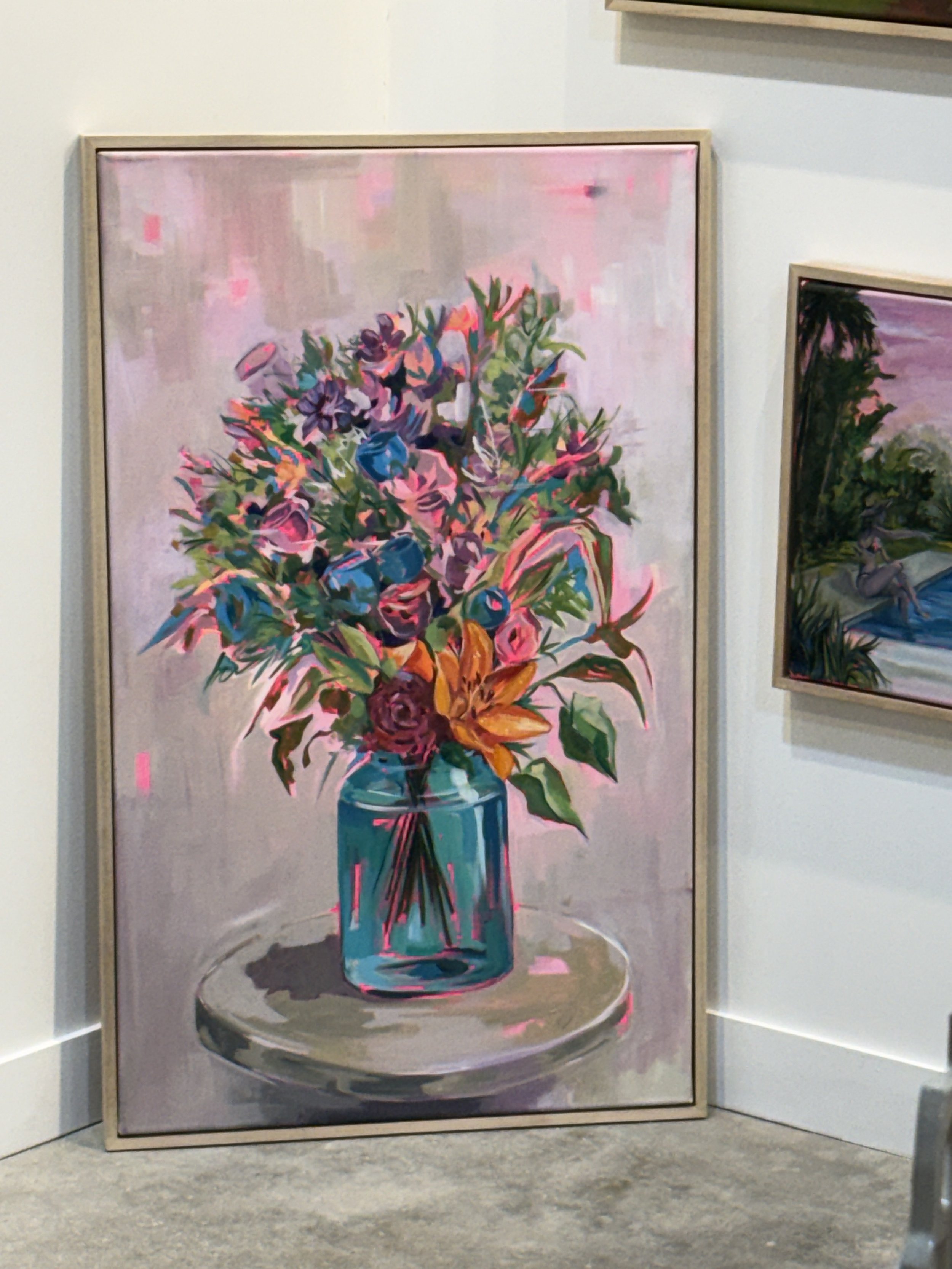
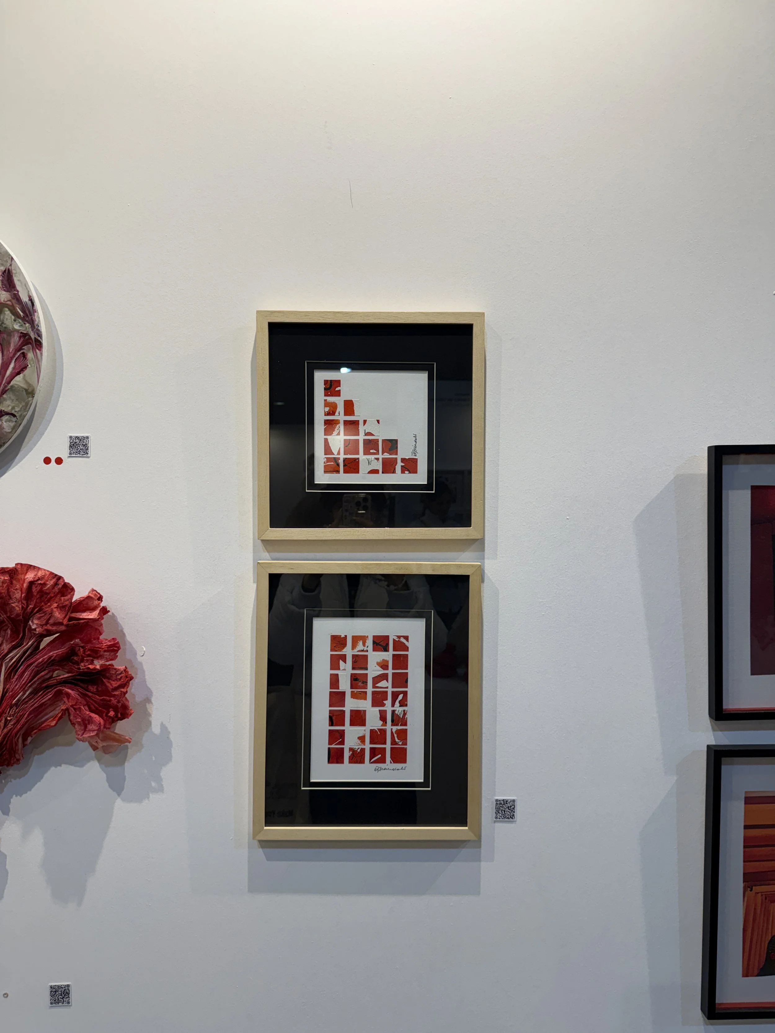
Last weekend, I spent the afternoon exploring MAPA Art Fair, one of Argentina's most exciting contemporary art fairs. While it's easy to get caught up in the concepts behind each piece or the artists themselves, I found my attention drifting somewhere else entirely. I kept noticing the materials: woven textiles, layered paper, thick brushstrokes, rough surfaces, stitched fabrics, collages, and unexpected combinations of textures. Almost every piece invited you to move closer, not because it was louder than the rest, but because it felt tangible.

Walking through the exhibition made me think about something we rarely talk about in branding. In a world where almost every visual identity is created on a screen, texture has become surprisingly rare. Most brands are designed to be perfectly clean, perfectly aligned, and perfectly digital. While that level of precision has its place, it often comes at the expense of something much more memorable: the feeling that a real person made it.
Texture has an incredible ability to communicate emotion before a customer even reads a single word.
A rough paper stock suggests craftsmanship, soft textiles evoke comfort, visible brushstrokes feel expressive, and layered collage elements hint at curiosity and creativity. These details influence how we perceive a brand and shape the expectations we have about the product behind it.
This becomes even more important when we think about packaging. Packaging is often the first physical interaction someone has with a brand, and it's one of the few opportunities to create a truly sensory experience. Choosing an uncoated paper, adding an embossed logo, incorporating natural fibers, or using handcrafted illustrations can completely change how a product is perceived. Two products may contain exactly the same thing, but the one with richer textures and more thoughtful material choices will almost always feel more valuable.
At Casa Bele, this idea has become a fundamental part of how we work. We often bring handmade elements into digital branding by scanning illustrations, paper textures, painted details, or collage compositions. It's not about making something look vintage or nostalgic. It's about introducing subtle imperfections that make a brand feel authentic. Those tiny irregularities (the edge of torn paper, the grain of watercolor, the pressure of a pencil line) are often the details that make a visual identity feel impossible to replicate.
Leaving MAPA, I realized that the pieces I remembered most weren't necessarily the biggest or the most colorful. They were the ones that made me slow down, look closer, and notice the craftsmanship behind them. I think the same principle applies to branding. In an increasingly digital world, brands don't always need more effects, more gradients, or more complexity. Sometimes they simply need more texture because texture reminds us that there are real people behind the work, and that's often what makes something unforgettable.