Custom Brand Identity for Verónica Brunati: A Unique Approach
A custom brand identity was created for Verónica Brunati, a leading female sports journalist. This handcrafted visual identity blends elegance, strategy, and subtle nods to football. It features refined typography, dynamic composition, and a versatile color palette. This branding reflects both her professionalism and her deep connection to the world of sports.
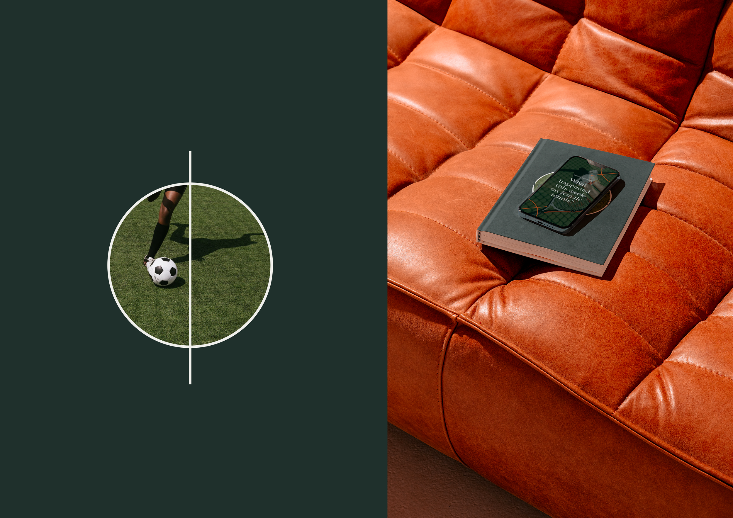
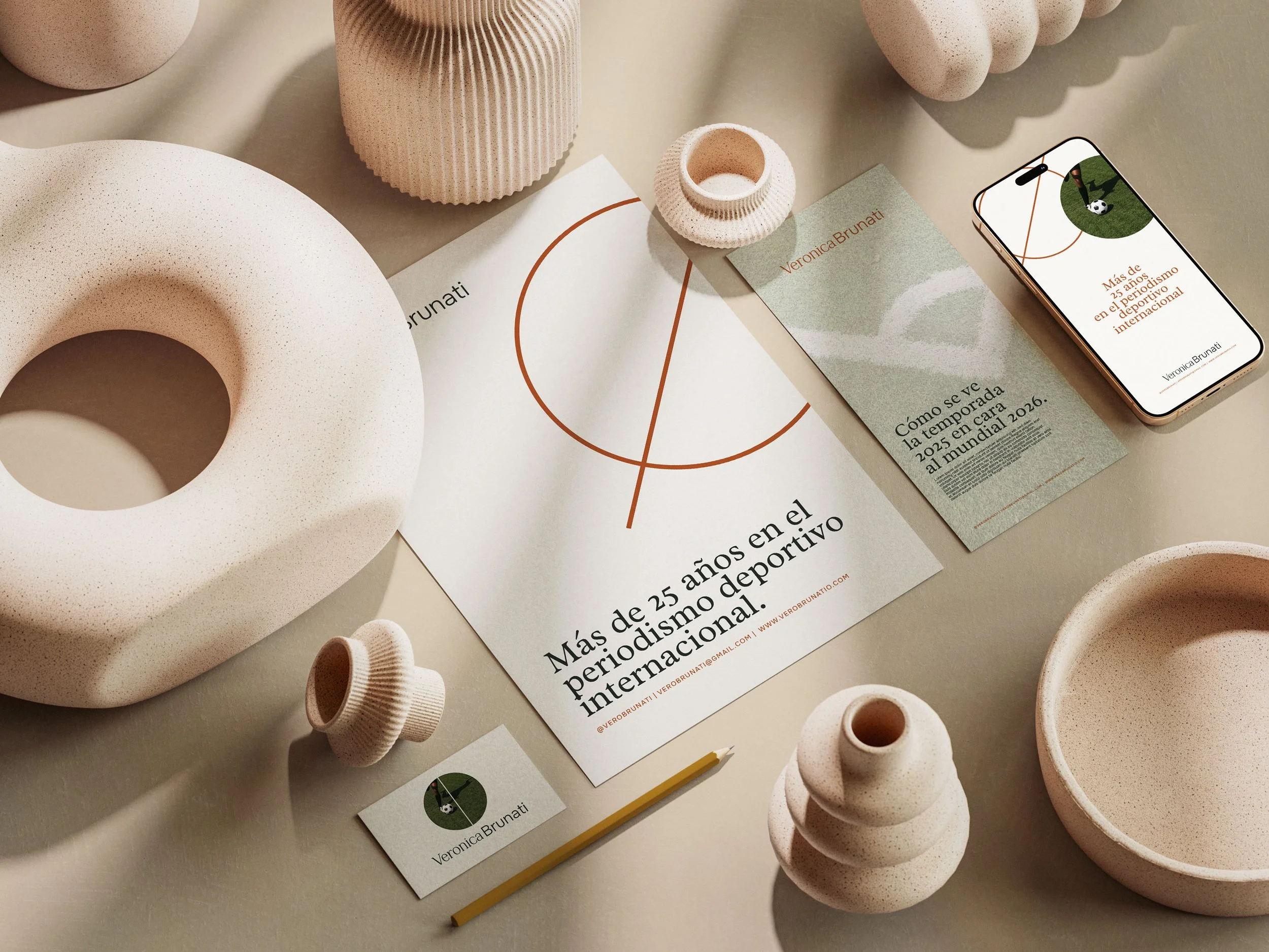
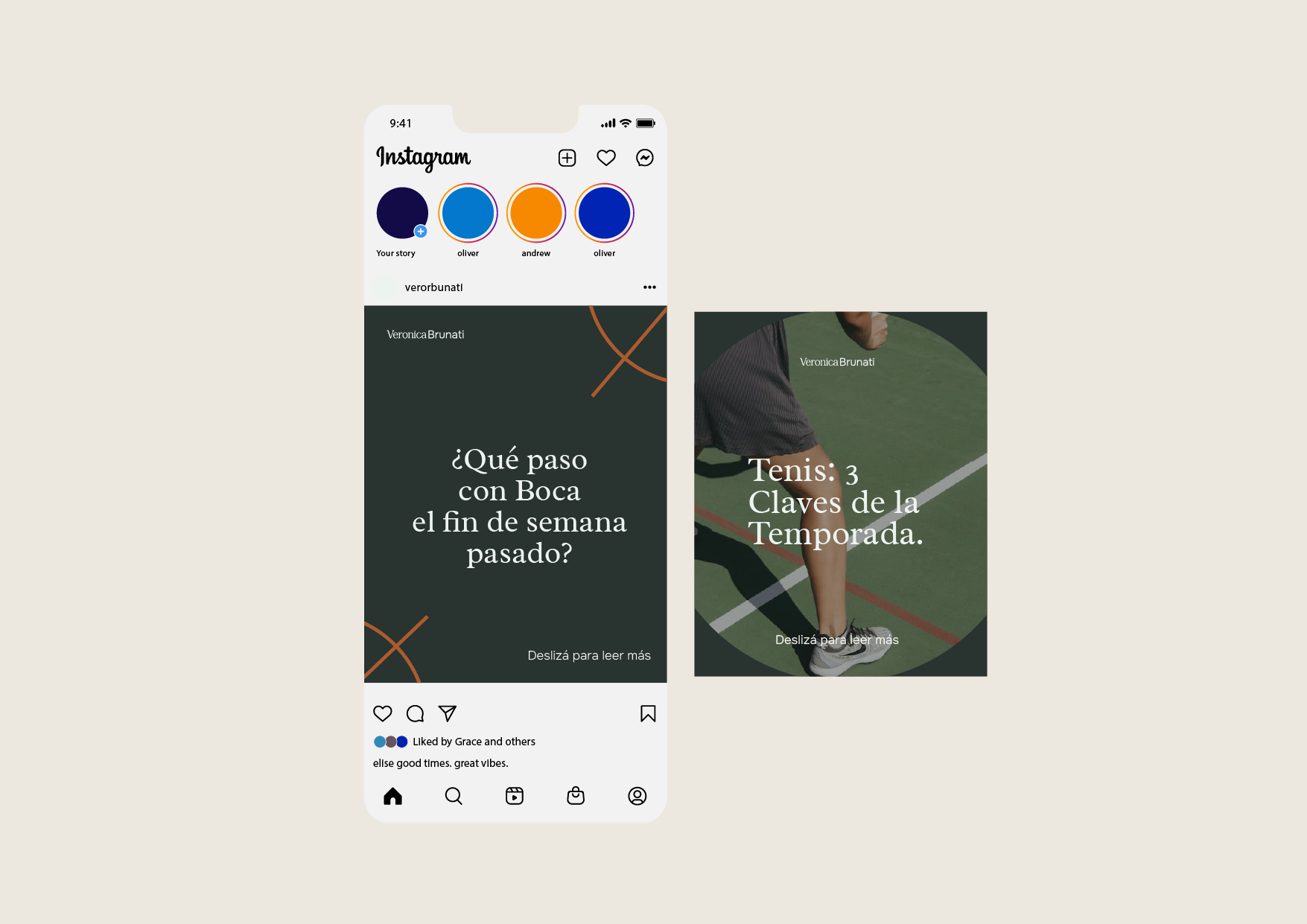
The brand's composition explores different atmospheres through color. It offers both dark and light versions that adapt to the context and tone of the communication. As a distinctive element, it incorporates a central trademark symbol inspired by soccer fields. This symbol visually encapsulates the brand's spirit: strategy, territory, and movement. It's a subtle nod to the sport that drives it, elegantly integrated into a versatile and contemporary identity.
Typography: A Central Element
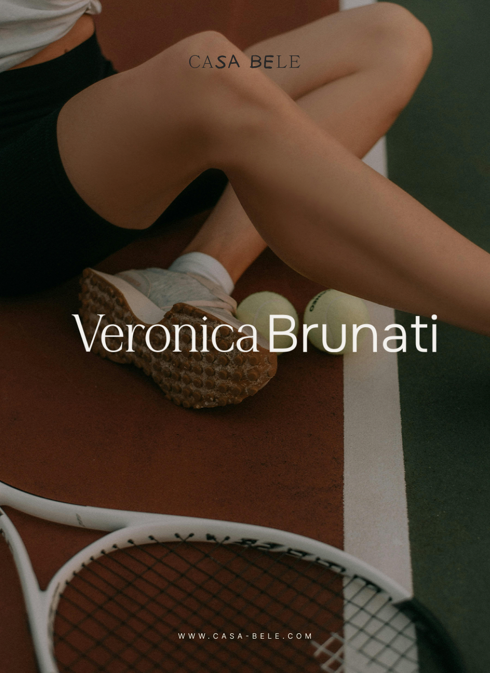
The logo utilizes typographic contrast as a central element to convey its essence. The name "Verónica," in a sober and refined serif typeface, conveys professionalism, history, and prestige. Next to it, "Brunati," in a sans serif typeface with soft, rounded edges, brings movement, harmony, and a subtle connection to the world of sports.
A brand's colors play a crucial role in its identity. The palette chosen for Verónica reflects her passion for sports while maintaining a professional tone. Dark hues partner well with lighter shades to create balance. This adaptability allows the brand to resonate in various settings, from formal events to casual sports gatherings.
Women in sports journalism face unique challenges. Verónica represents not just herself but all women making strides in this field. A strong, distinct brand identity helps her stand out. It allows her to challenge stereotypes and assert her place in a male-dominated industry. By embodying elegance and strength, she inspires other female journalists to follow suit.
Concluding Thoughts: A New Era in Sports Branding
In conclusion, the custom brand identity for Verónica Brunati is much more than a visual appeal. It represents a movement within sports journalism, advocating for female representation. The crafted design encapsulates professionalism while paying homage to the sport she loves. Brands like hers redefine what it means to be a female sports journalist.
The vision behind her branding aligns with the changing tides in the industry. As more women break into sports journalism, having a strong brand identity becomes essential. Verónica's story is a testament to the power of thoughtful branding, as it resonates deeply with her audience. It’s an inspiring model for emerging female journalists aiming to assert their place in the field.